DESUP | Brand Design
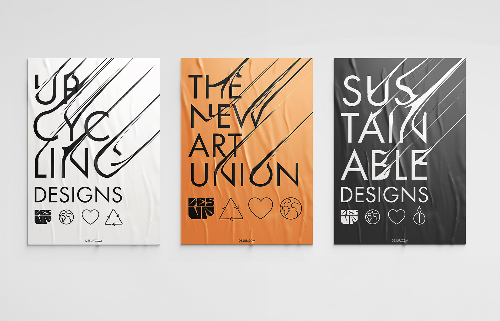
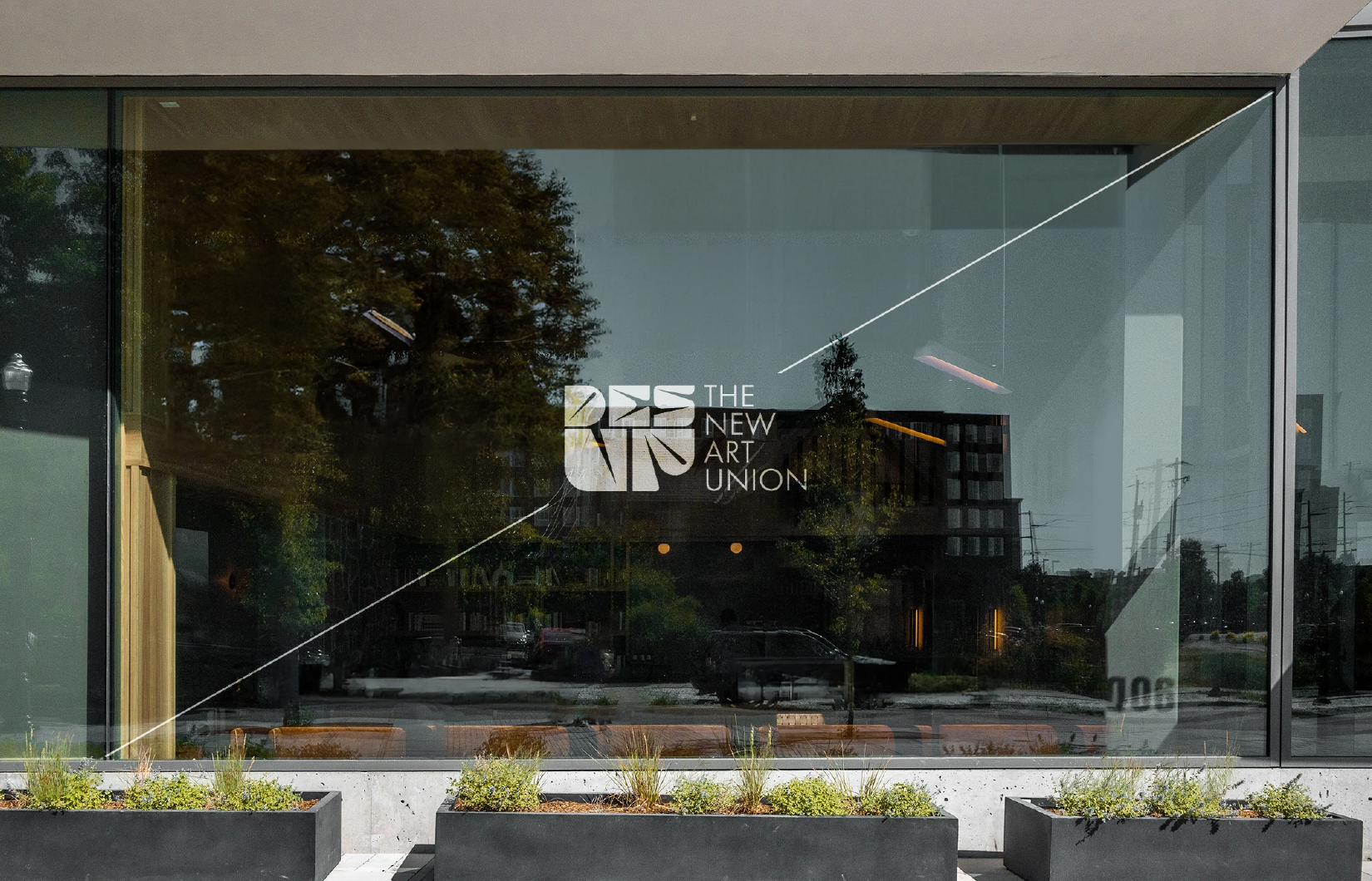
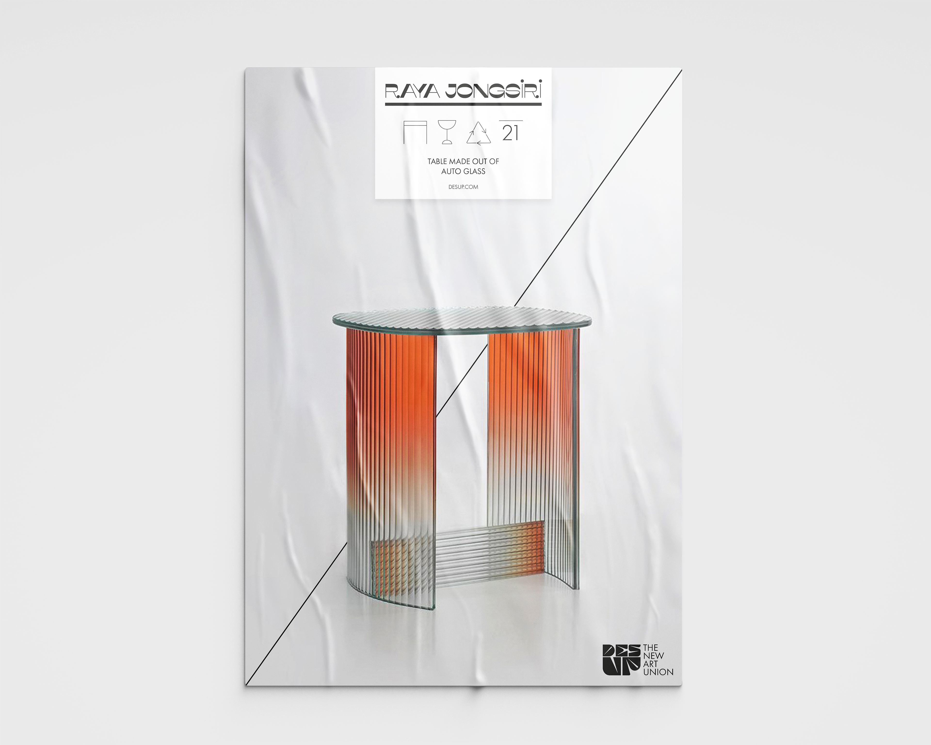
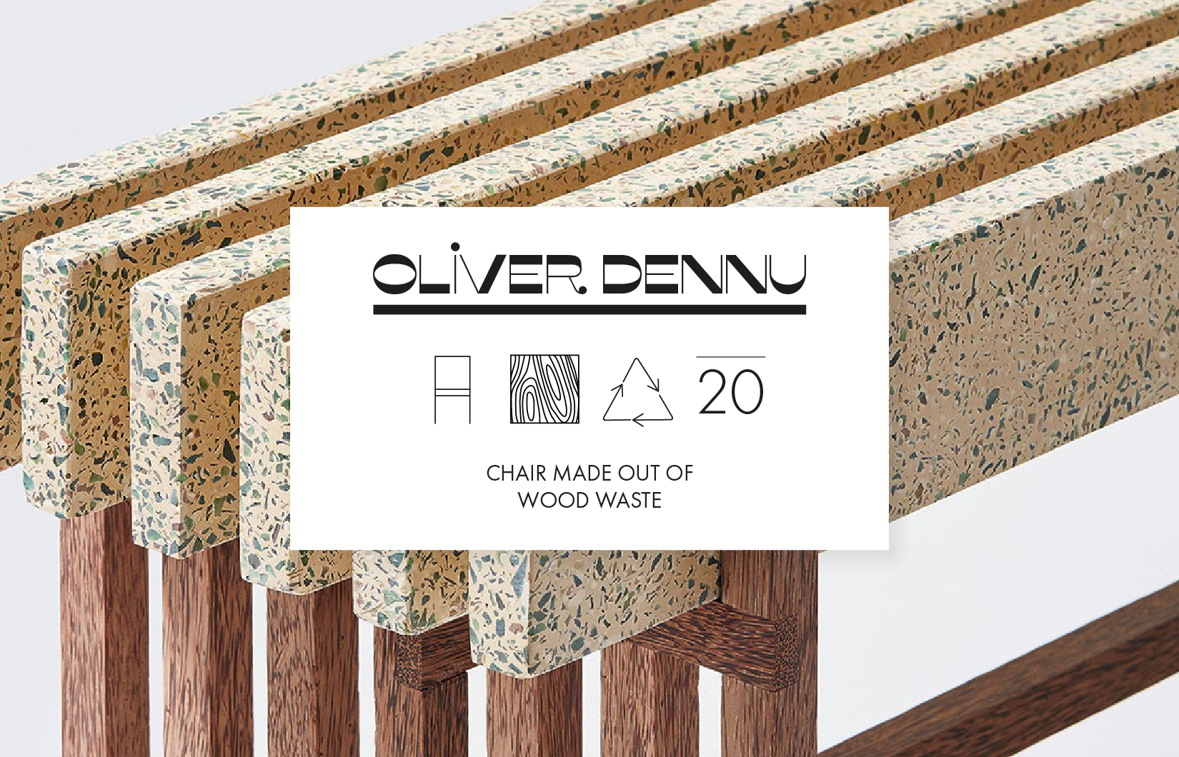
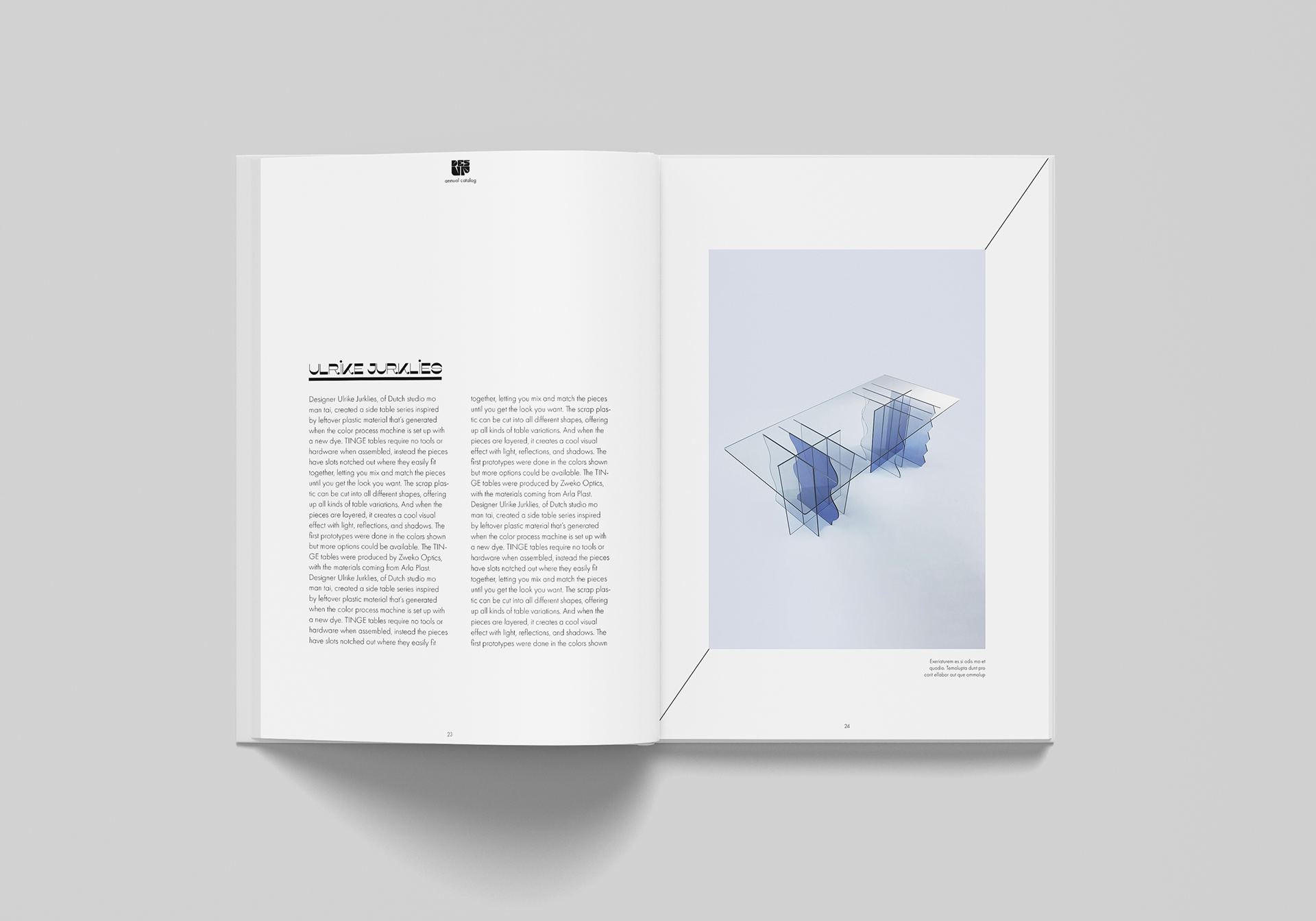
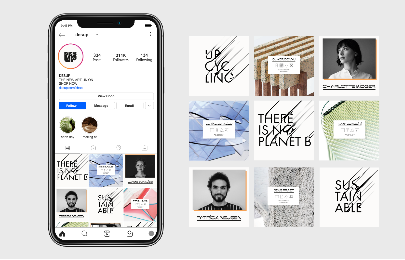
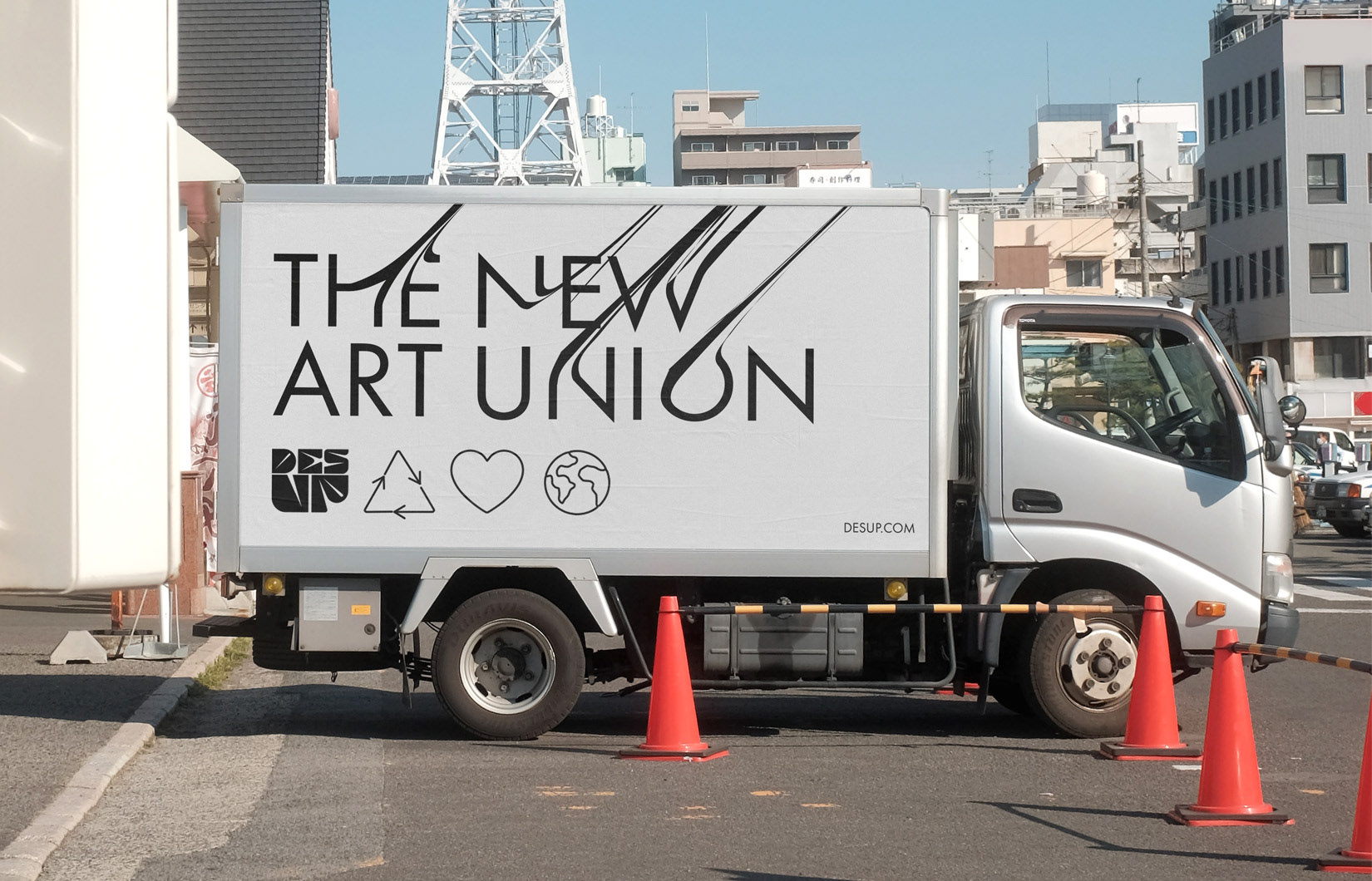
Desup is a new influential art association of the 21st century, in which artists create interior designs that are predominantly made from recycled raw materials. As a small university project, a visual identity was created for the association, which focuses on providing a new stage for the artists as a brand.
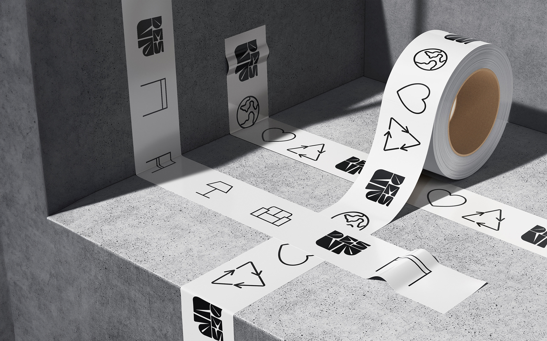
Desup is a fusion of DESign and UPcycling. The font of the logo was inspired by crushed plastic bottles. The UP is an important visual element in the design, and appears as a steadily rising line from bottom left to top right. Either in a minimalist form to bring the objects to the fore, or in a louder and bolder exercise when it comes to Art Union's main application. By focusing on the use of icons, the most important information of the composition is communicated in a simple way. The white information area is based on the classic clothing label.